Data Visualization
Kelly McConville
Stat 100
Week 2 | Fall 2023
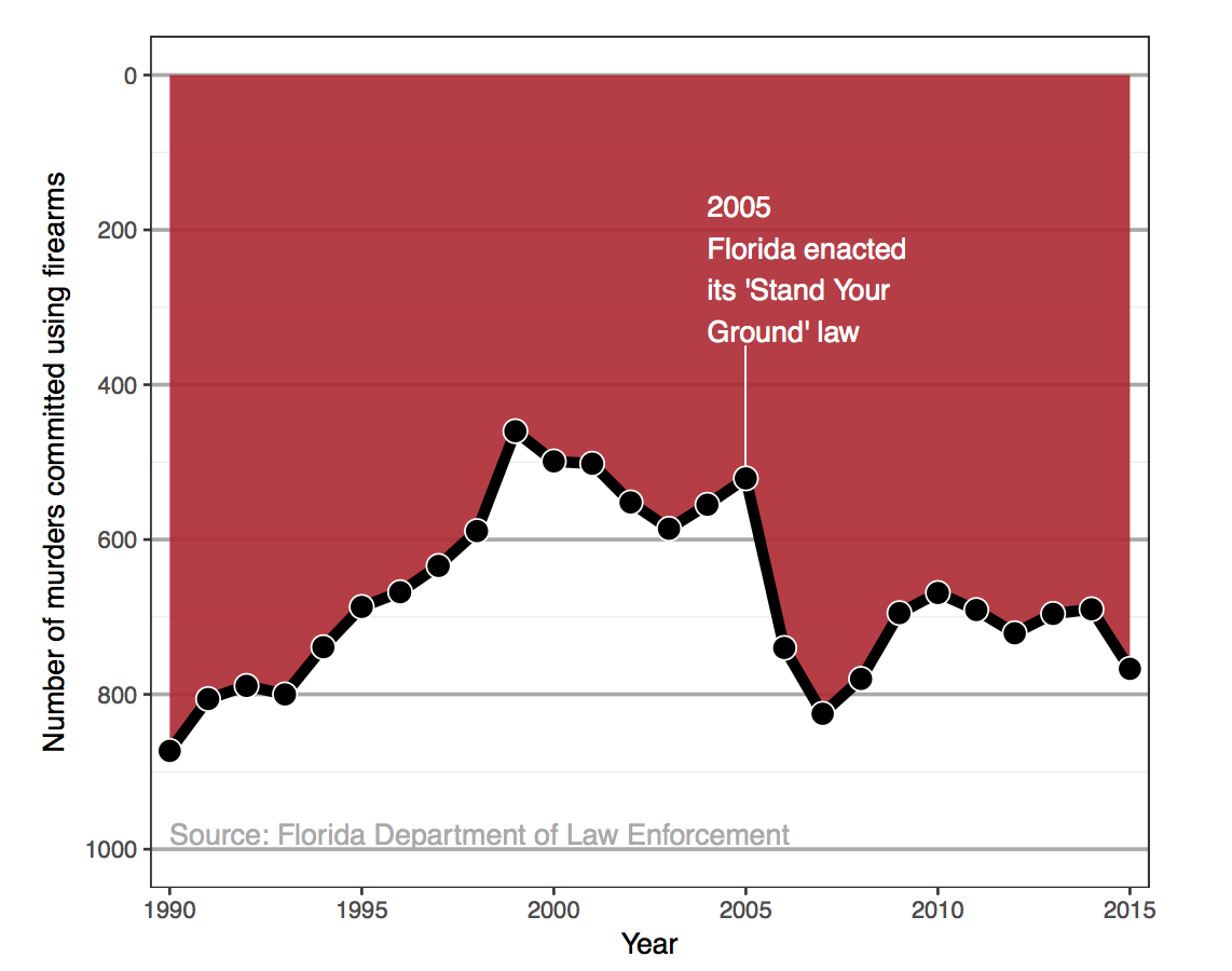
Challenger
Here’s one of those charts.
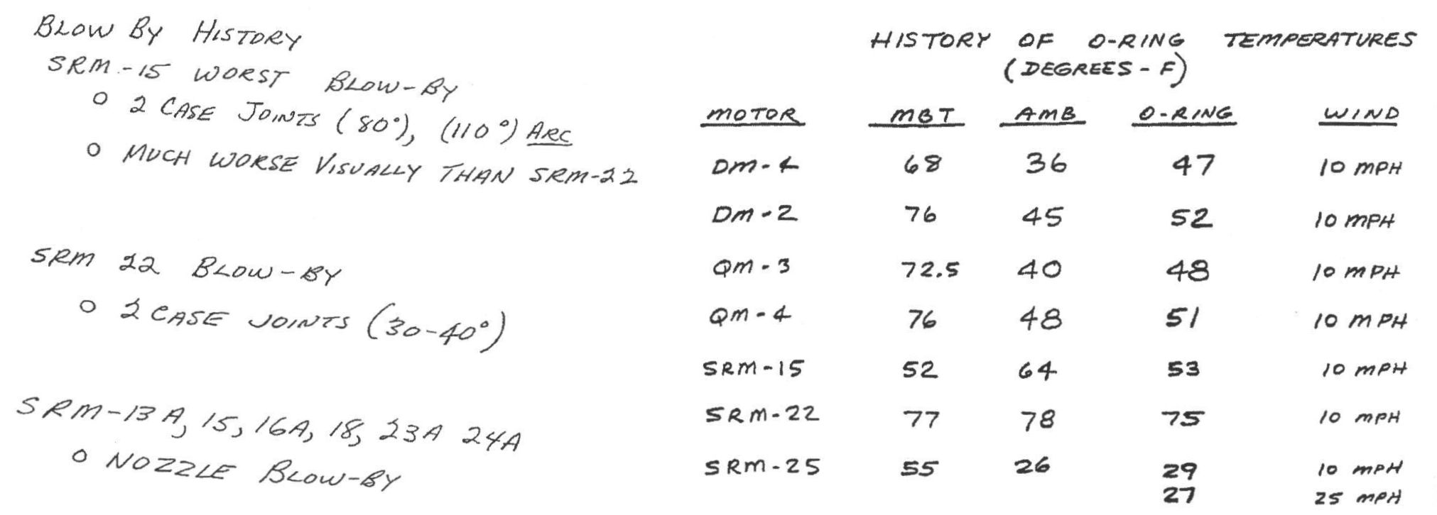
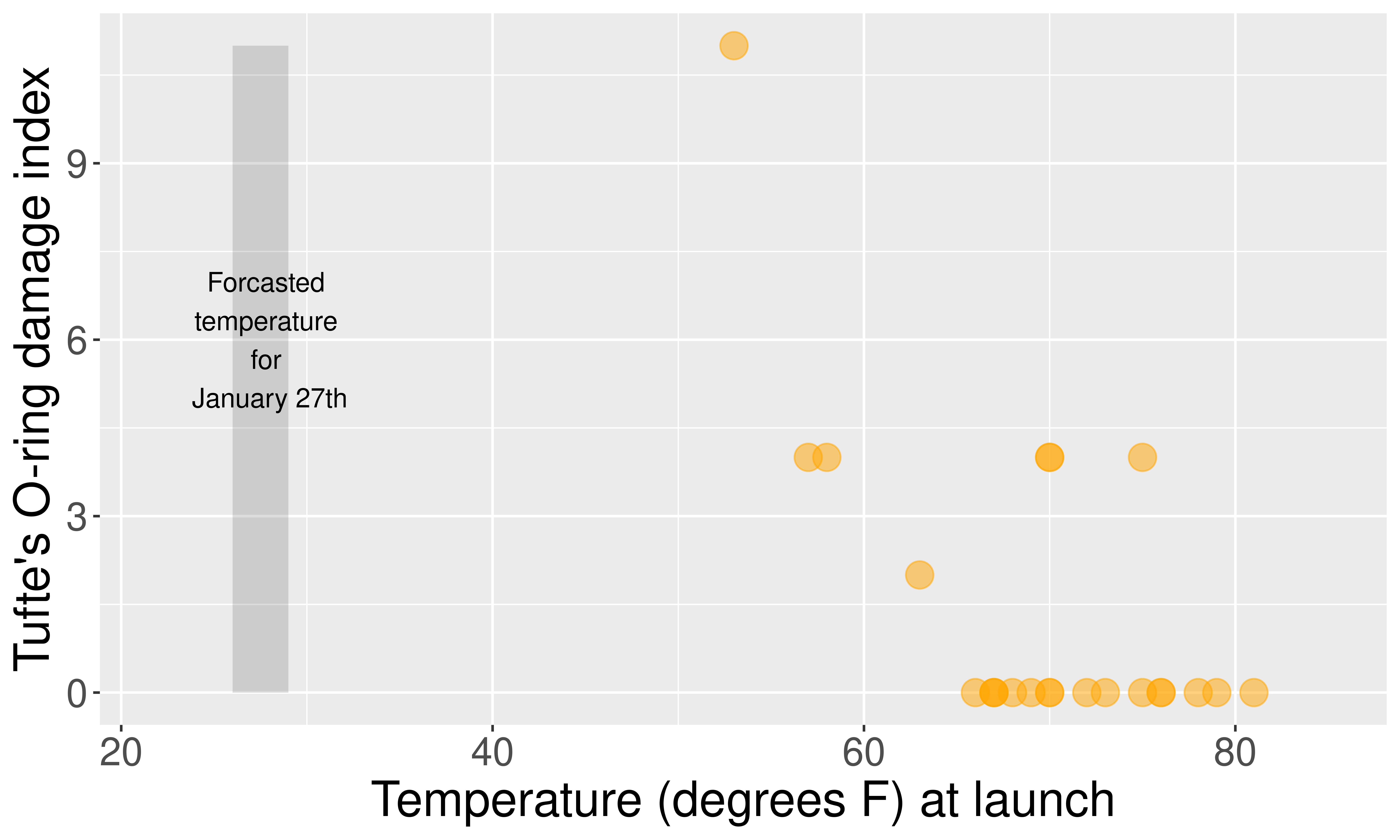
Challenger
Here’s another one of those charts.

Challenger
This adaptation is a recreation of Edward Tufte’s graphic.
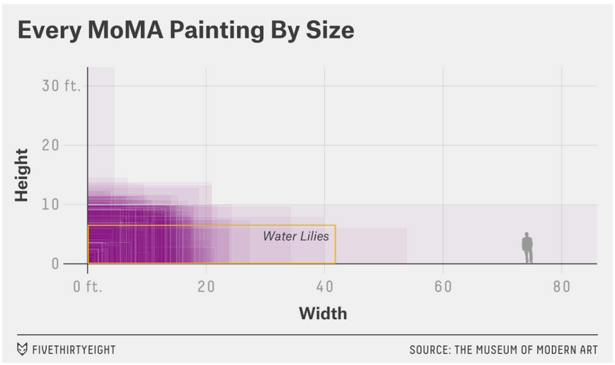
Example 1
- What are the variables?
- What geom are the variables map to?
- What are the aesthetics of the geom?
- How is each variable mapped to an aesthetic?
- What additional context is provided?
- What story is the graph telling?
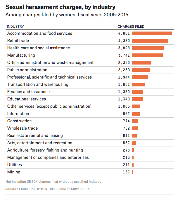
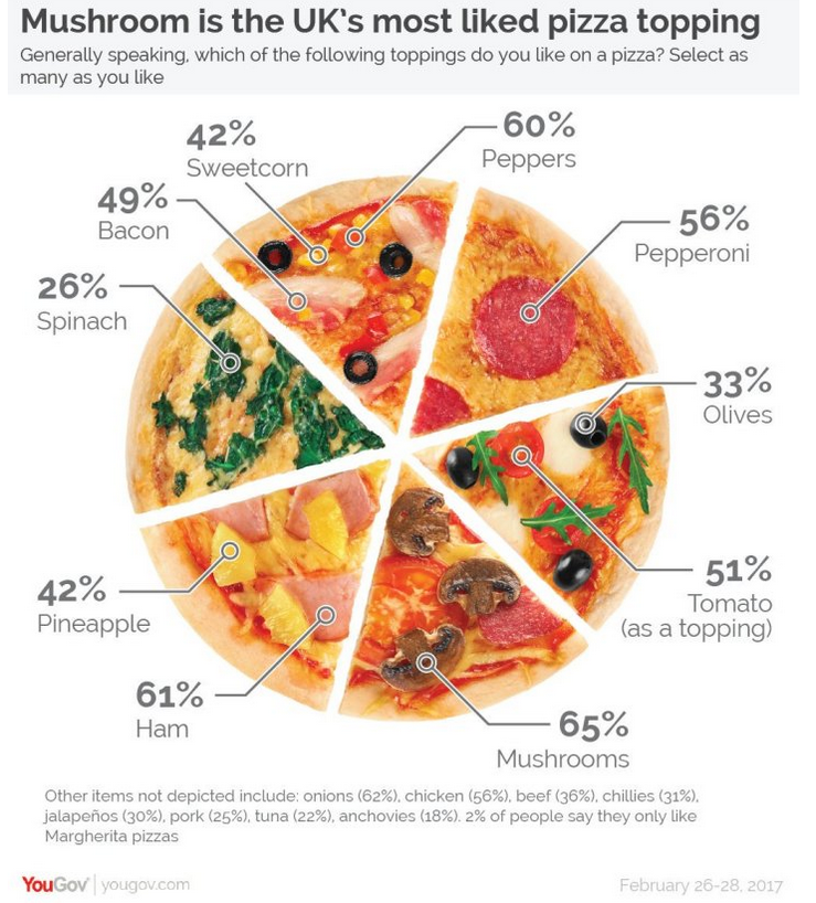
Example 2
- What are the variables?
- What geom are the variables map to?
- What are the aesthetics of the geom?
- How is each variable mapped to an aesthetic?
- What additional context is provided?
- What story is the graph telling?
Context Example
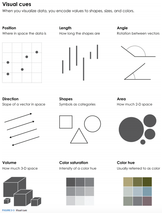
What visual cues are easier to compare?
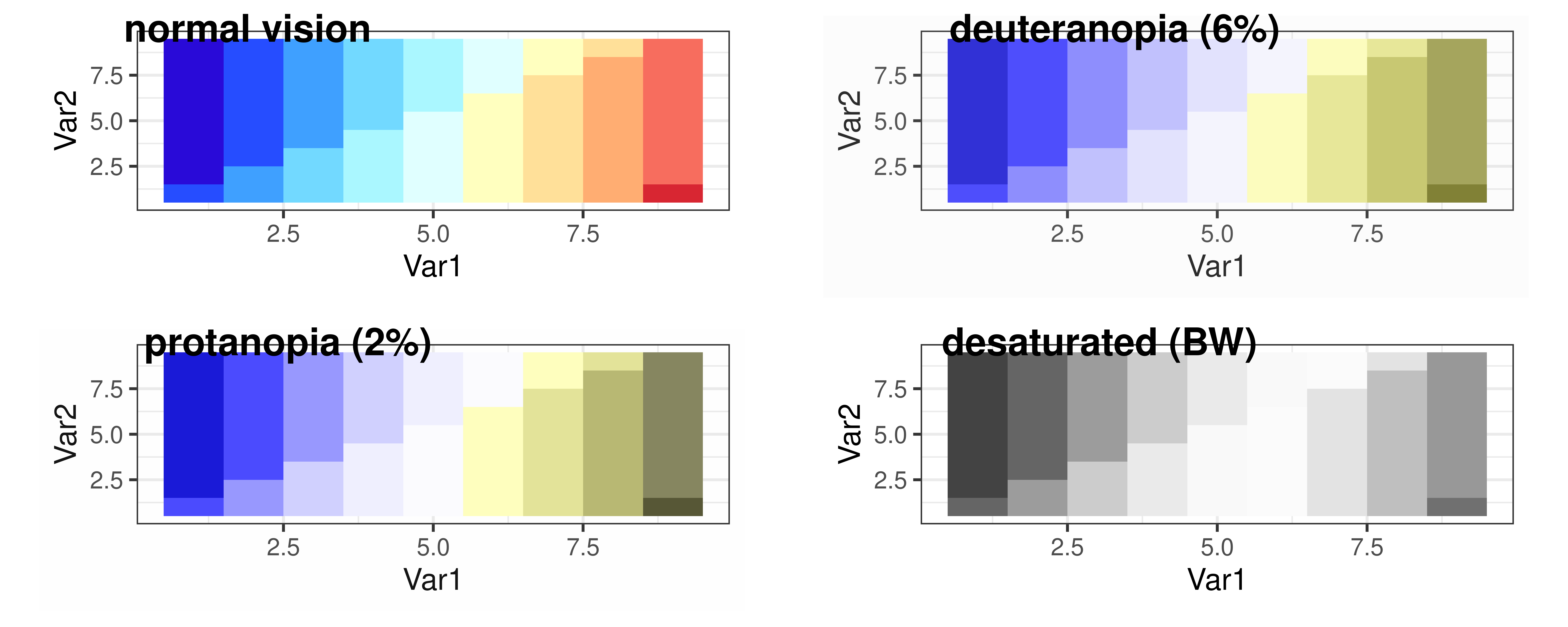
What to consider with color?
Consider color blindness.
Color Palettes – Sequential
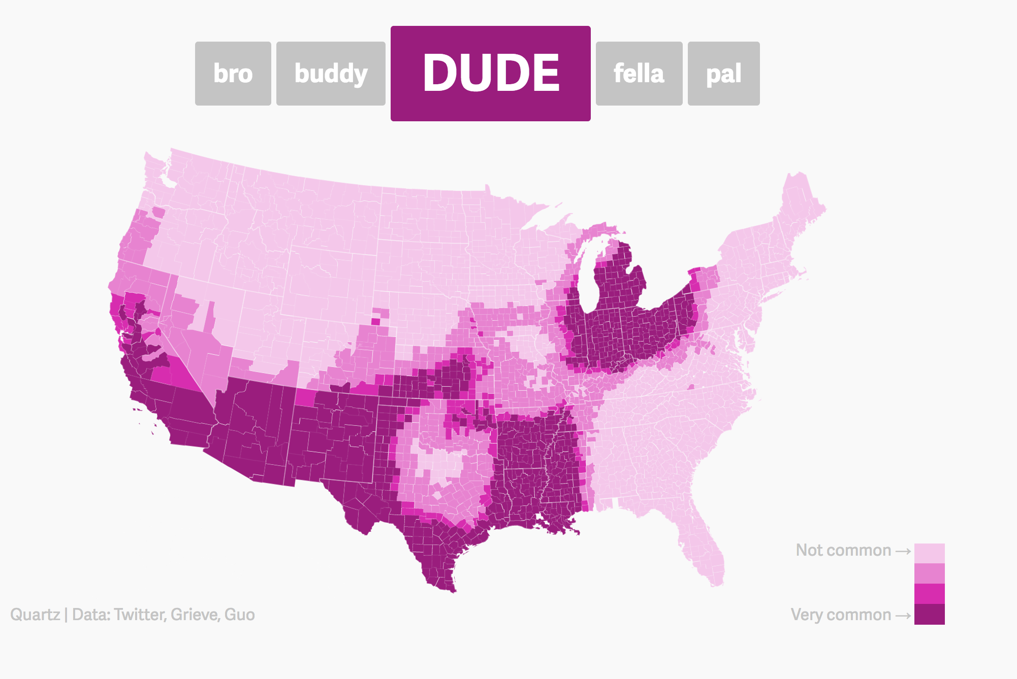
Maps, like the Dude map are also a great way to provide context!
Color Palettes – Diverging
Color Palettes – Qualitative
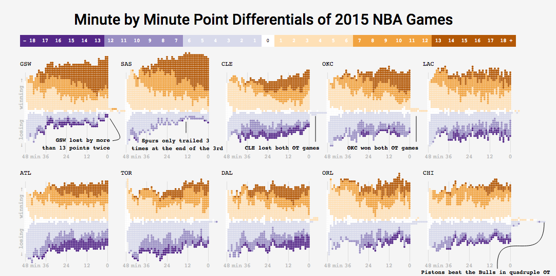
Many Ways To Visually Tell A Story
Washington Post’s Approach:
Bad Graphics
Because of all the design choices, it is much easier to make a bad graph than a good graph.
Misleading Graphics
Be careful that your design choices don’t cause your viewer to draw incorrect conclusions about the data:
- Just letting the software make all the design choices can still lead to misleading graphs (recall the Georgia COVID graph).
Load Necessary Packages
ggplot2 is part of this collection of data science packages.
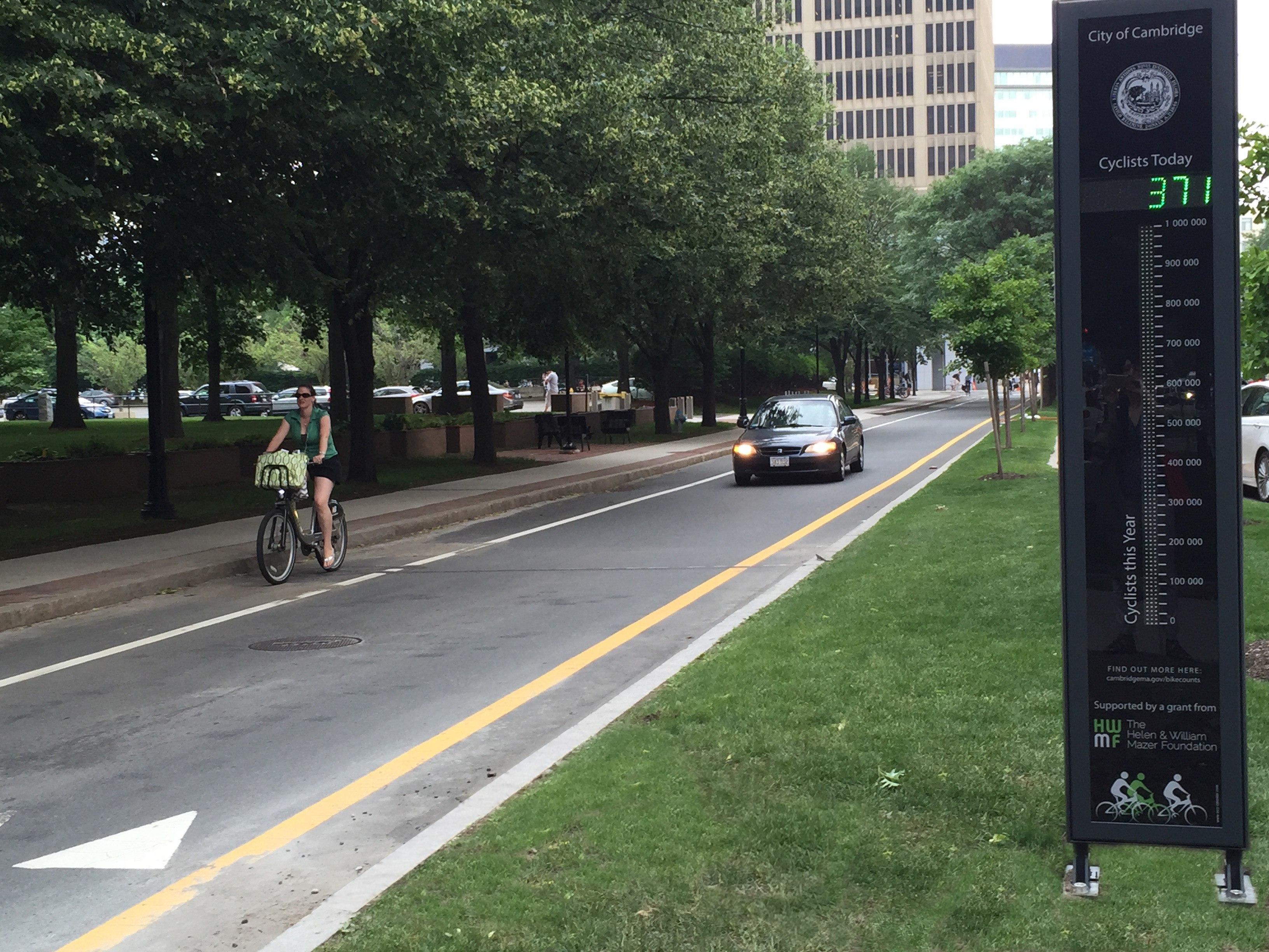
Data Setting: Eco-Totem Broadway Bicycle Count

Histograms
Binned counts of data.
Great for assessing shape.
Data Shapes
Histograms

Histograms
- mapping to a variable goes in
aes() - setting to a specific value goes in the
geom_---()
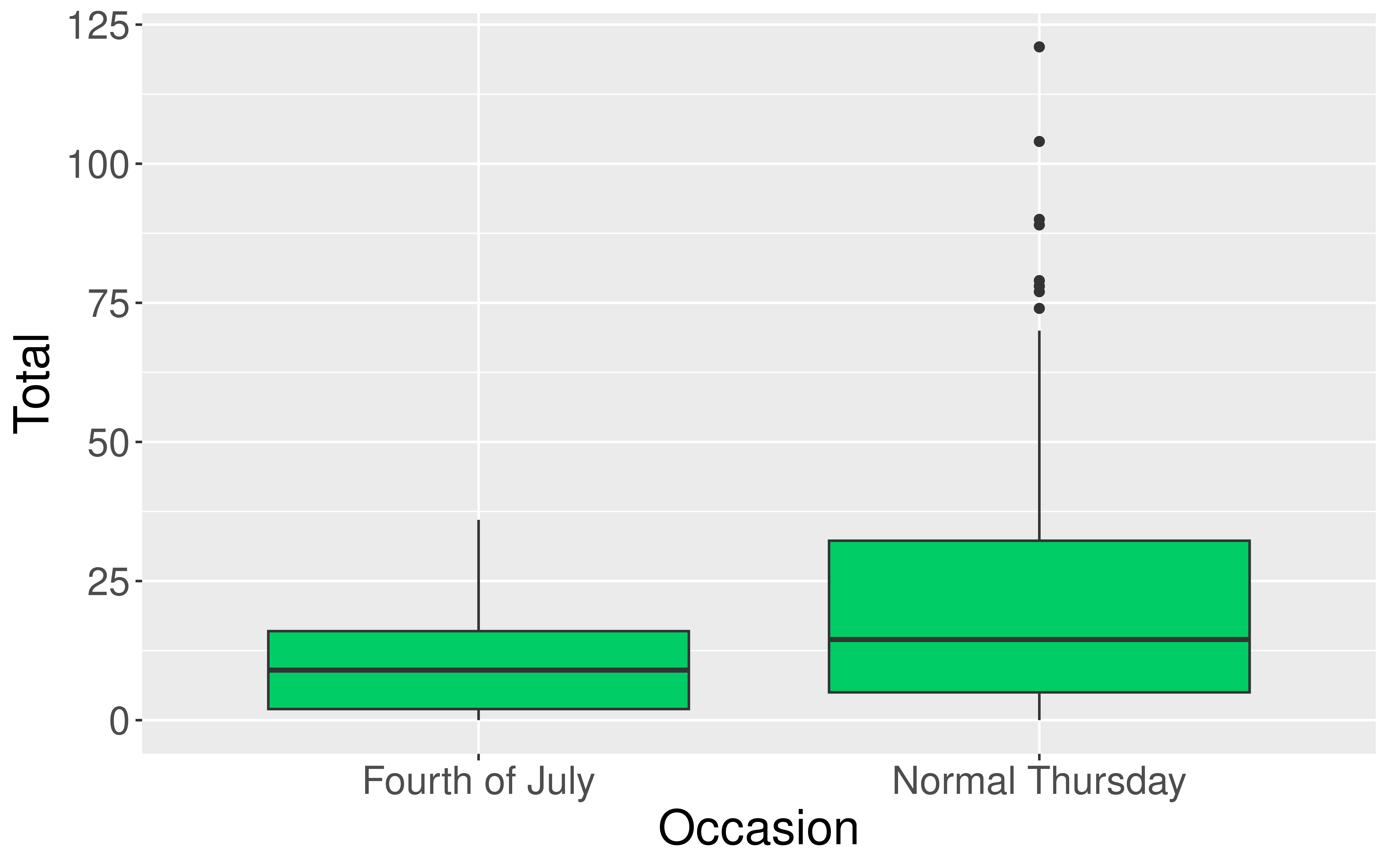
Boxplots
- Five number summary:
- Minimum
- First quartile (Q1)
- Median
- Third quartile (Q3)
- Maximum
- Interquartile range (IQR) \(=\) Q3 \(-\) Q1
- Outliers: unusual points
- Boxplot defines unusual as being beyond \(1.5*IQR\) from \(Q1\) or \(Q3\).
- Whiskers: reach out to the furthest point that is NOT an outlier

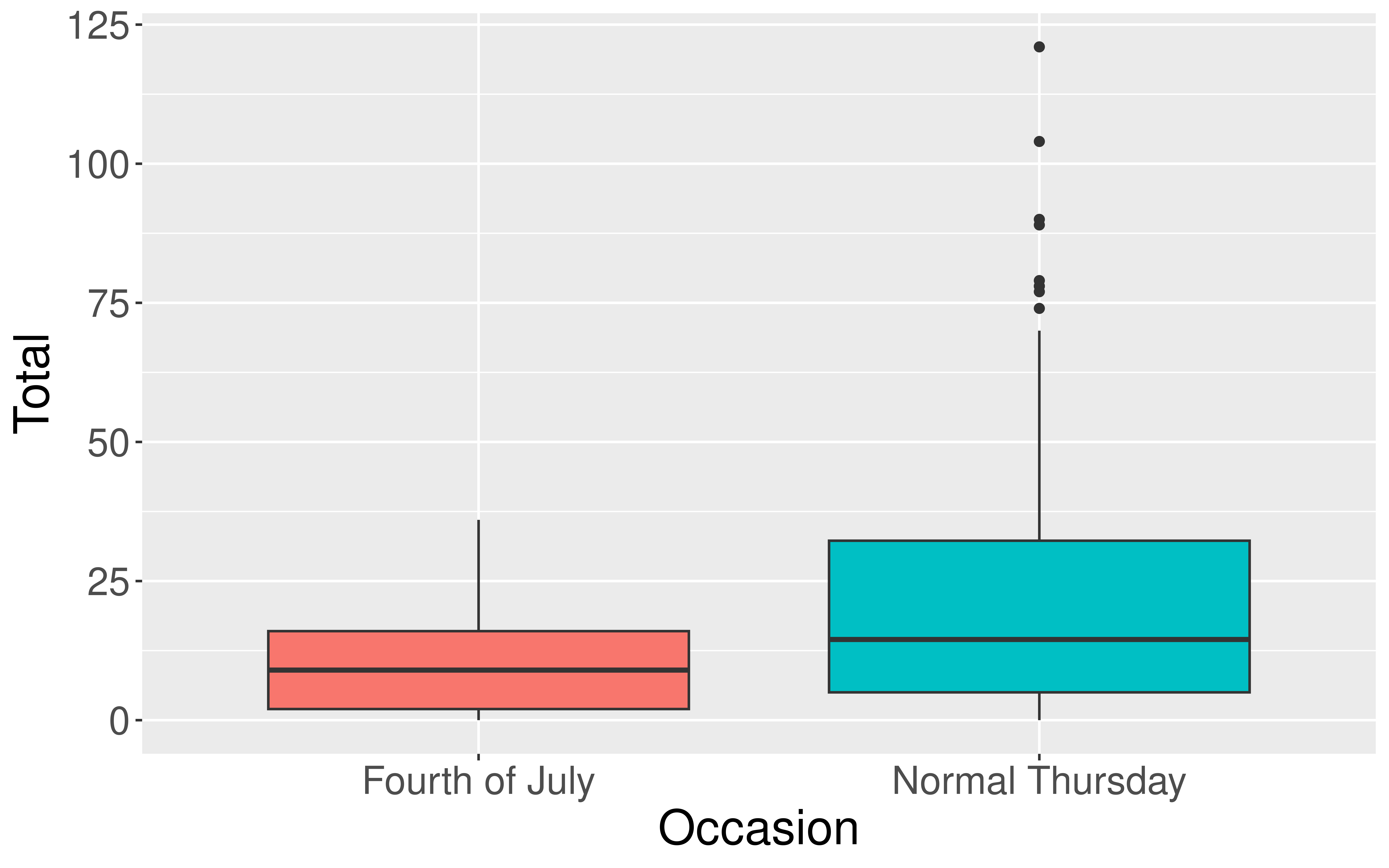
Boxplots
Boxplots
Boxplots
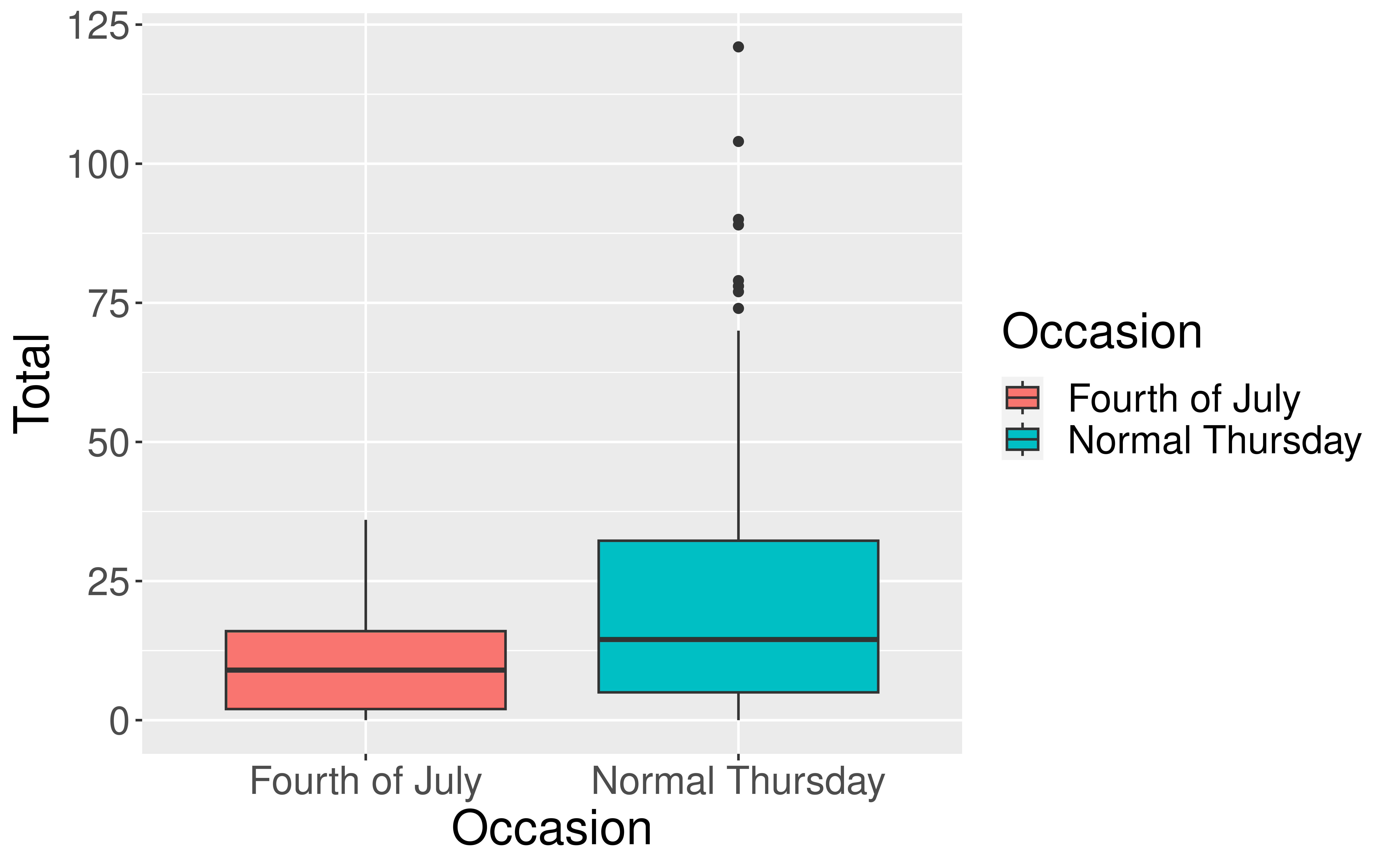
Boxplots

Violin Plots
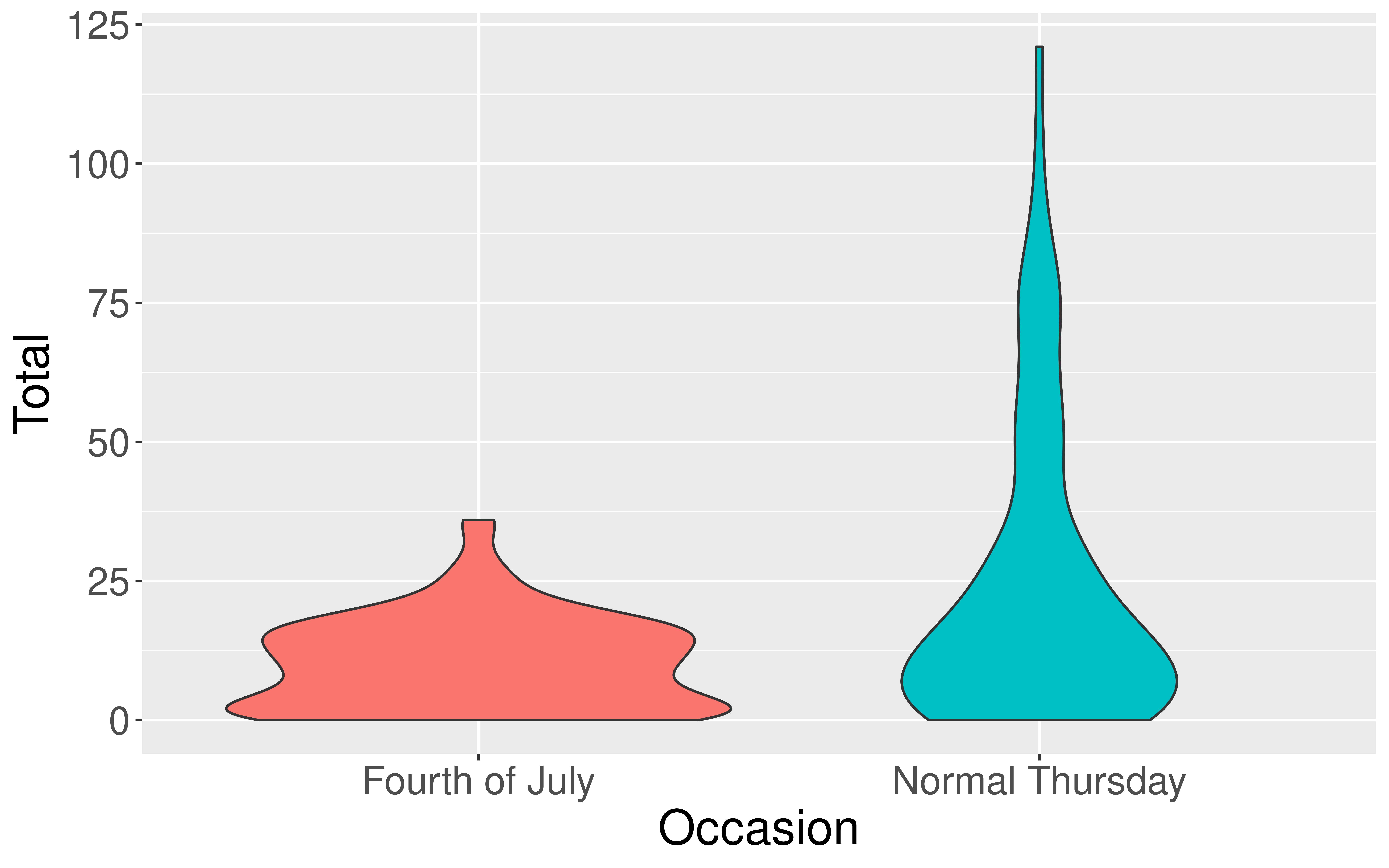
Boxplot Versus Violin Plots